Organizing the brand portfolio
SAS is a thorough platform for educational solutions for every stakeholder within the school environment. Present in over 860 schools across Brazil, it holds the pedagogical tradition of Colégio Ari de Sá in its history and offers content, technology and integrated services.
Challenge
Due to the constant growth in its product portfolio, the need to better understand what SAS has to offer came up: how to simplify and organize the way its 82 services are shown? Megalo was invited to face this challenge by restructuring the brand’s architecture and renewing SAS’ identity.
Solution
We started off by conducting a research to look into SAS’ brand perception. The diagnosis guided how we organized the brand architecture and directed how future products and services are created. We worked on the visual pattern of the brands and created a new institutional identity for the platform.
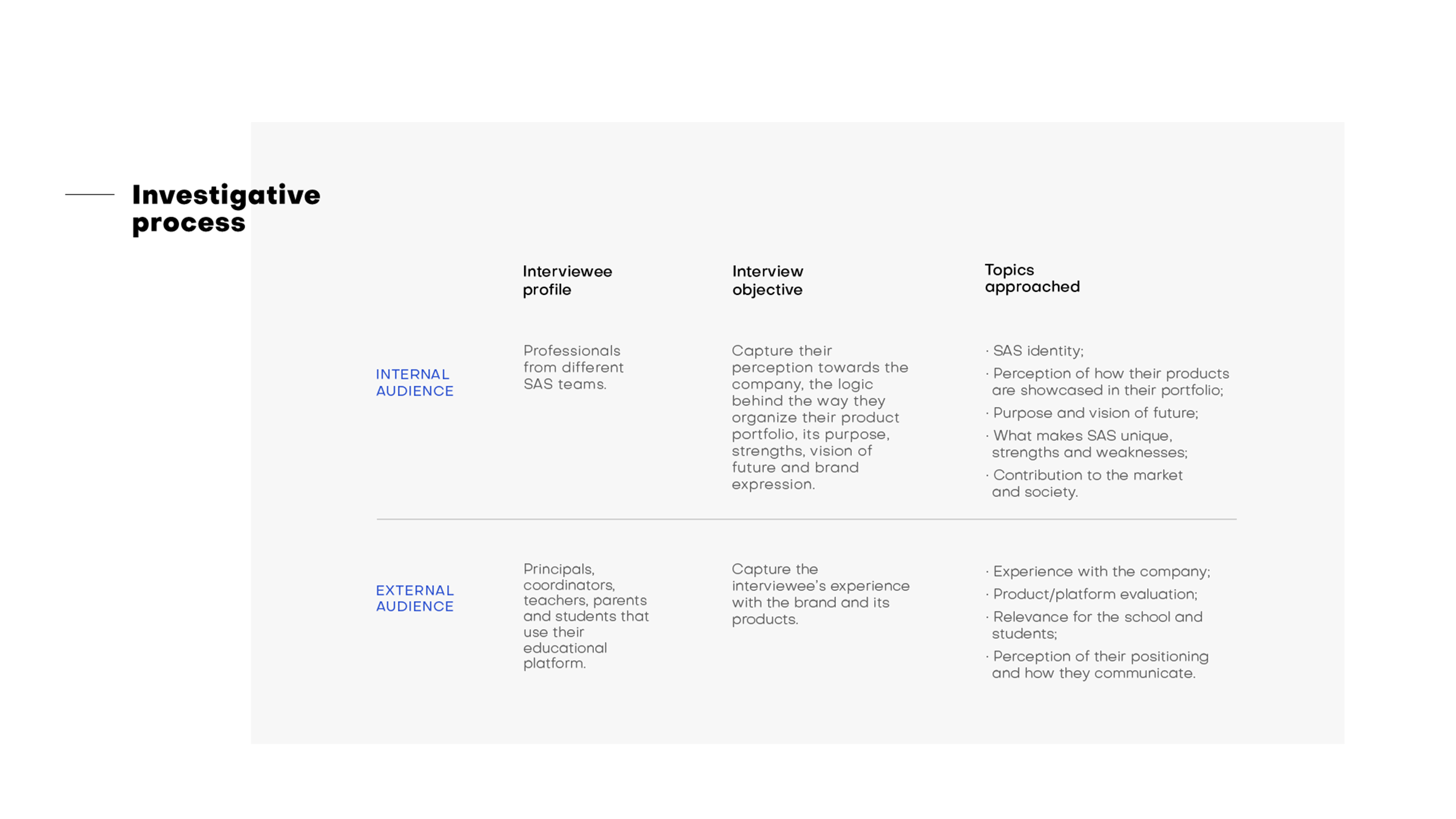
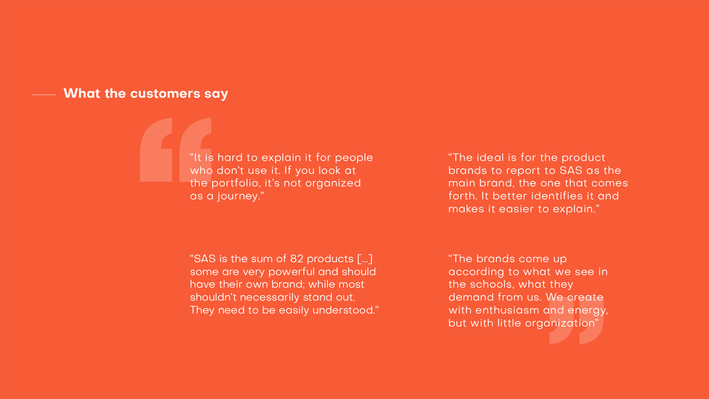
01. RESEARCH
Looking for a precise diagnosis
We began our project by conducting multiple interviews in depth in order to investigate the company’s perception, both internal and external, as well as the users’ experience within the educational platform.
02. STRATEGY
An organized product portfolio
Our analysis pointed out the use of different brands for products with similar functions, which enabled us to reduce them from 82 different assets to 22. Afterwards, we organized the platform under 4 pillars of action: Teaching and learning; Evaluations; Training; Consulting. We then distributed all of their offers under these pillars, in a process that simplified the way their services were understood and set the standard for the creation of new brands.
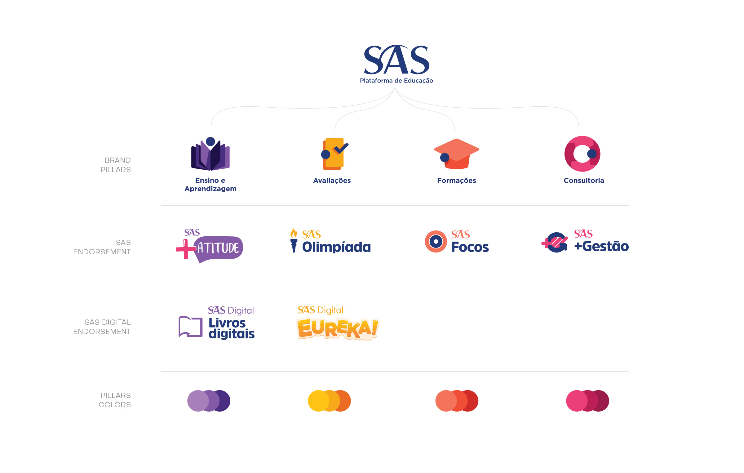
Guiding the creation of future brands
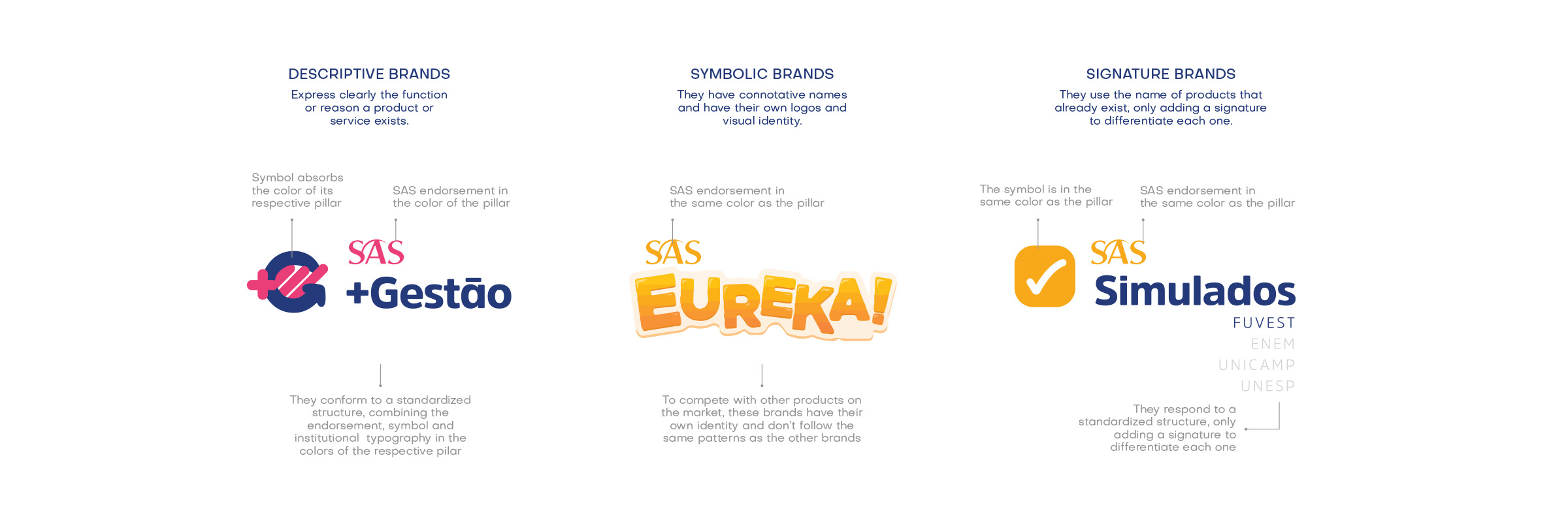
The next step was to develop a decision matrix to guide the way new brands are created. According to the strategy of each product or service, the matrix points out what the type of the brand is – descriptive, symbolic or signature – and how it should be visually structured.

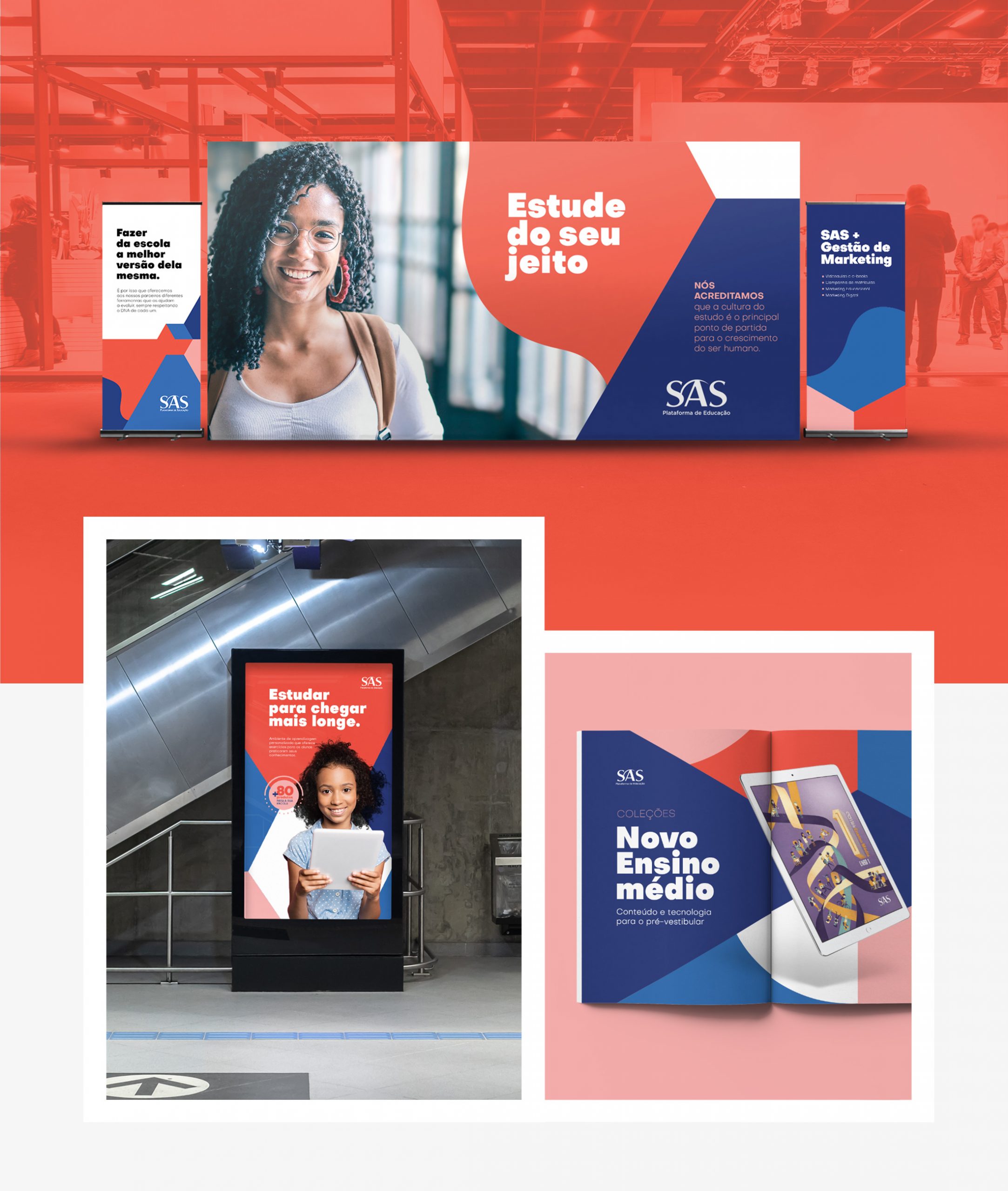
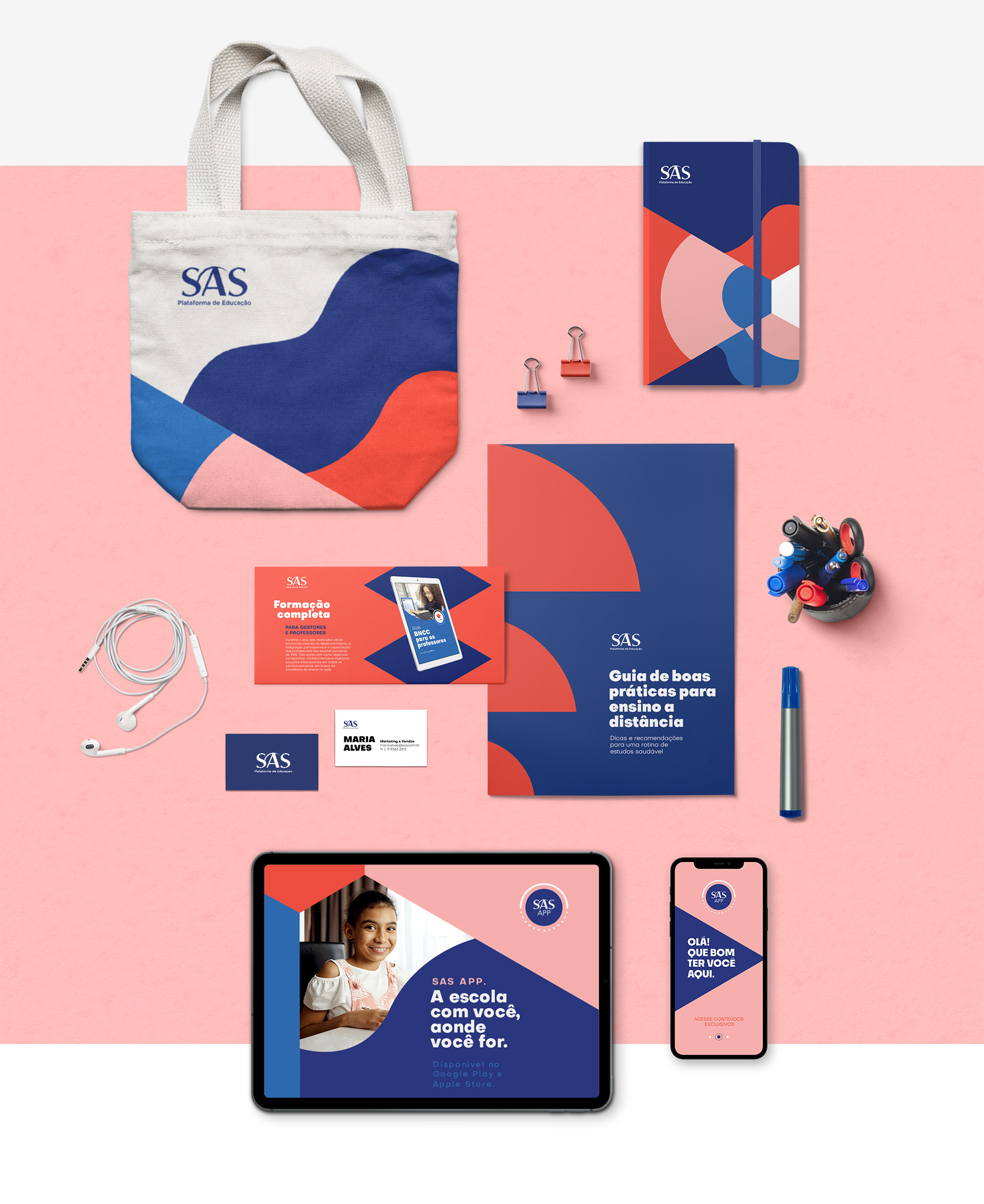
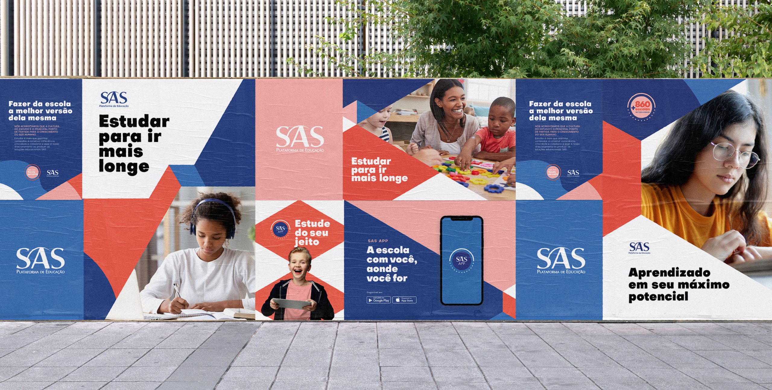
An important part of this work was to elaborate the visual patterns of every brand to ensure they are easily identifiable and guarantee SAS’s credibility. Besides a visual structure according to the type of service, every one carried SAS or SAS Digital’s support, and the colors varied according to each pillar.
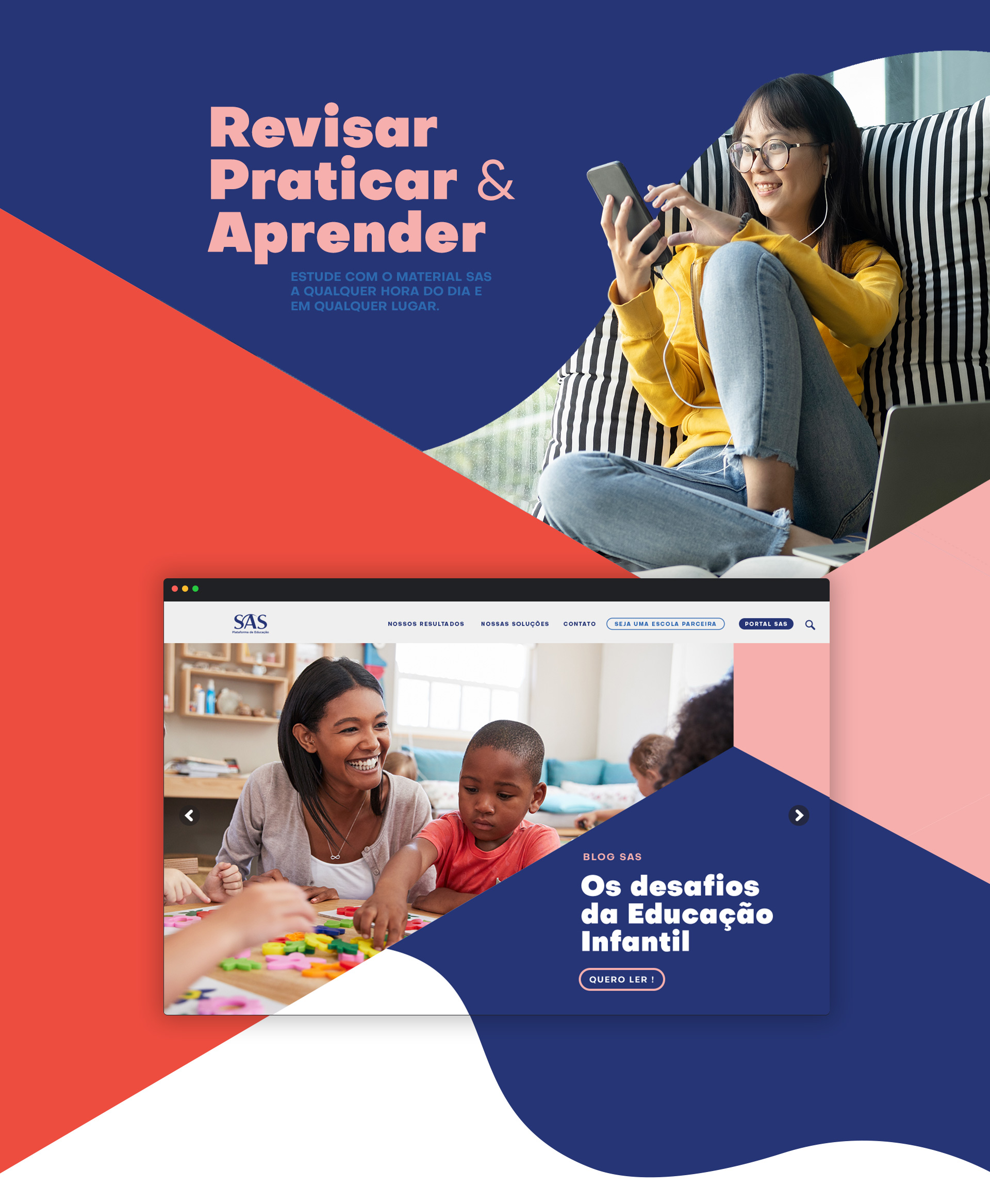
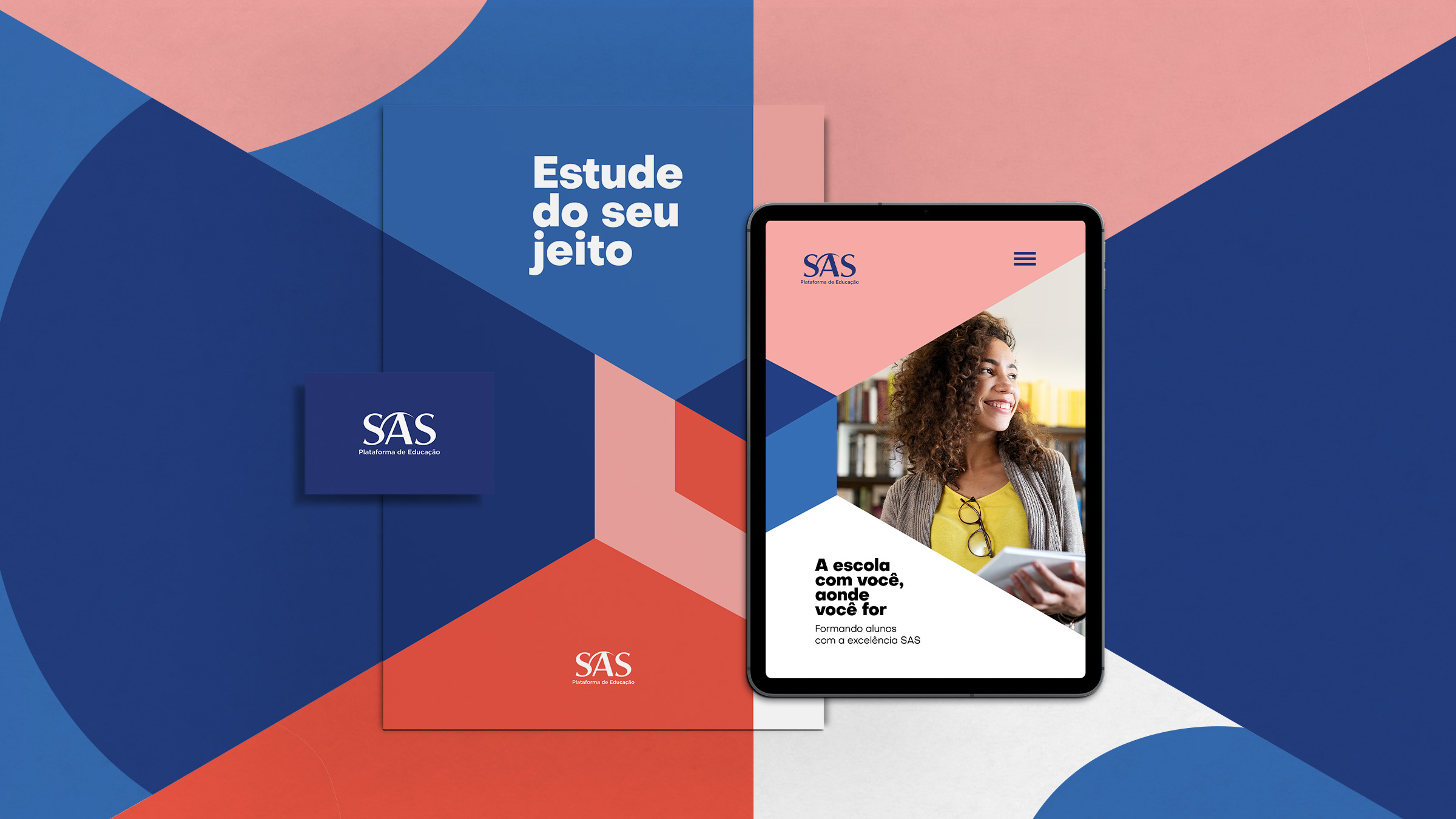
03. IDENTITY
A new identity created from the best that SAS has to offer
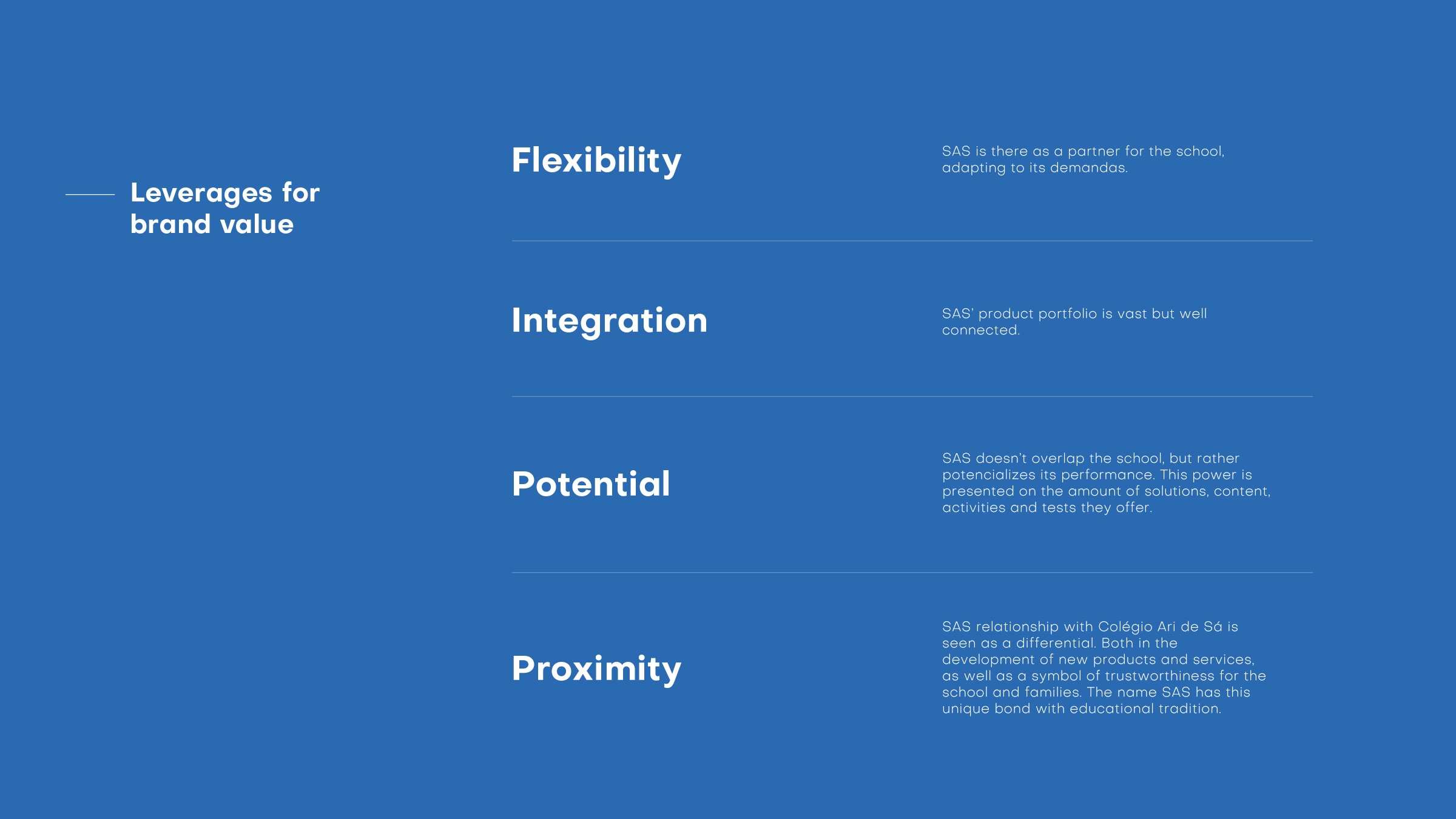
From the leverages of brand value pointed out at the beginning of our immersive process, we developed an identity that causes an immediate perception of the brand and values its differentials: flexibility, integration, potential and proximity.