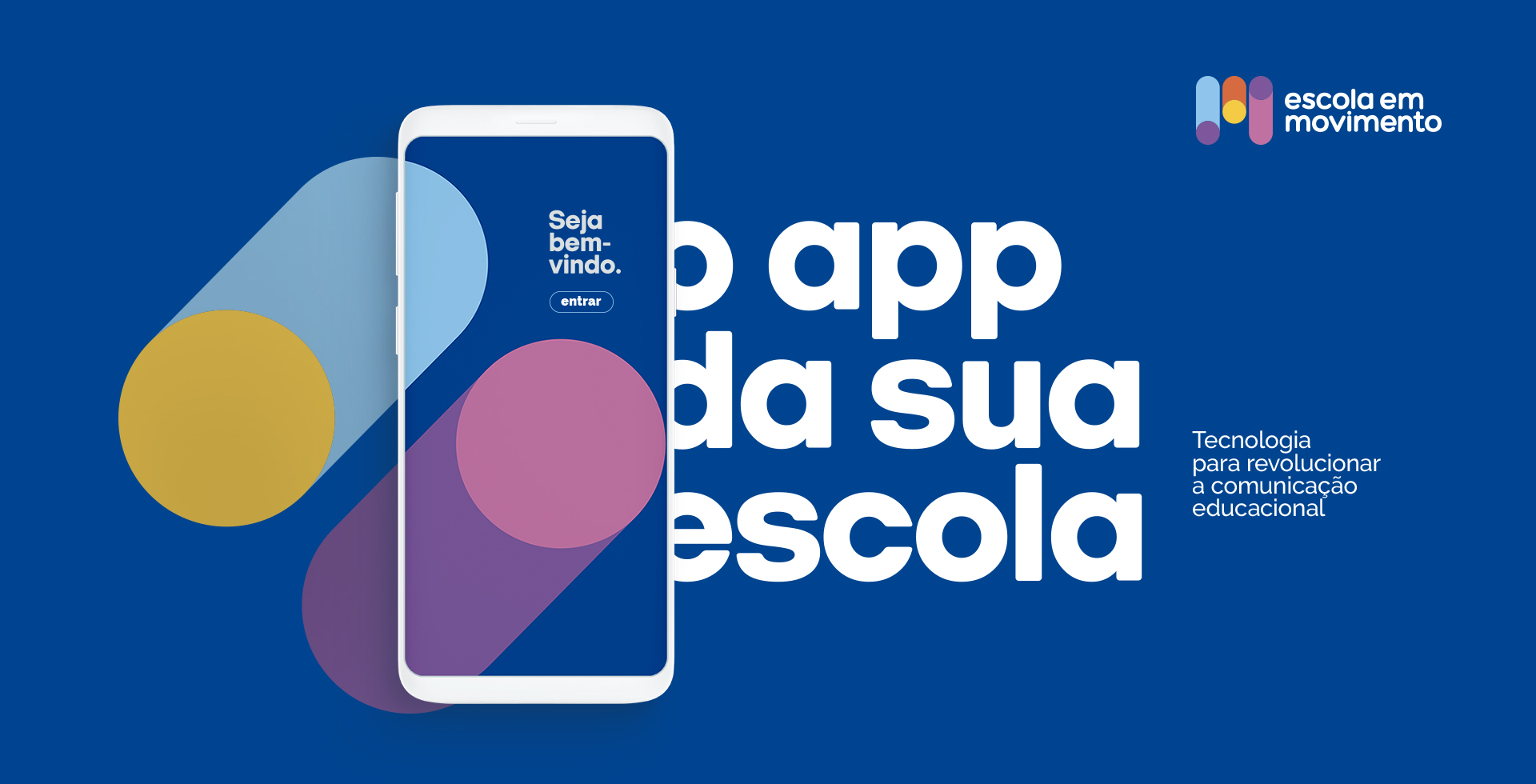
Escola em Movimento Identity
Escola em Movimento was created in 2013 as an app designed to be a digital school diary that enables simple, secure, and effective conversations among school, students, and staff.
Challenge
As the business grew, Escola em Movimento began to offer a broader portfolio of products: much more than a school diary, this project became a robust tool for communication, offering a complete set of solutions for the school and families alike. Along this new positioning came the need to update the brand in order to combine the amplitude of new services to the previously stablished values with its customers.
Solution
We’ve led an immersive research with the board of directors, managers and clients to better understand the purpose, strengths, vision of future and brand expressions in order to translate them into a visual concept. We then developed a symbol that privileges dynamism, vigor, and intimacy, while also strengthening the company’s core values. We arranged the brand architecture by defining the strategy that guided the naming process for complementary services, as well as the development of the brand’s visual identity and brand guide.


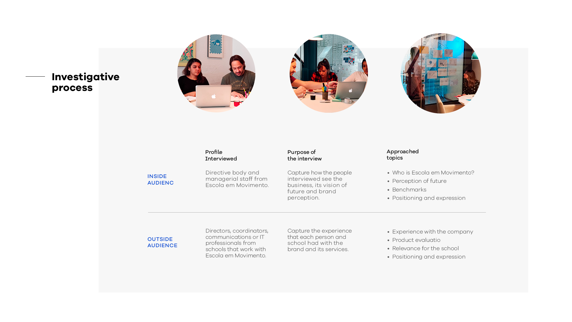
01. RESEARCH
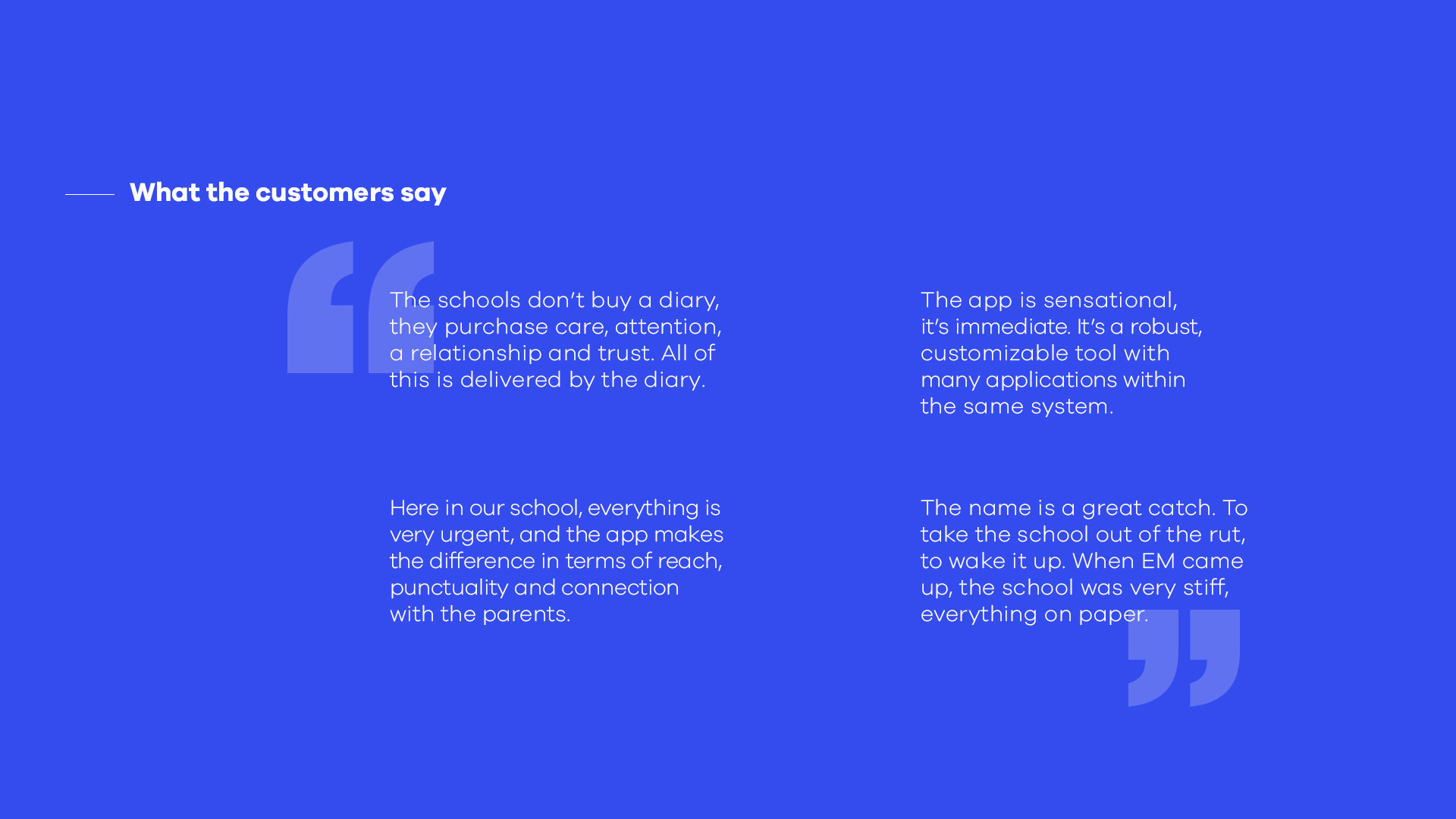
The first step was an immersive stage with the client
Throughout this investigation process we had in-depth interviews in order to capture the company’s self-perception as well as their customer’s point of view.
02. BRAND
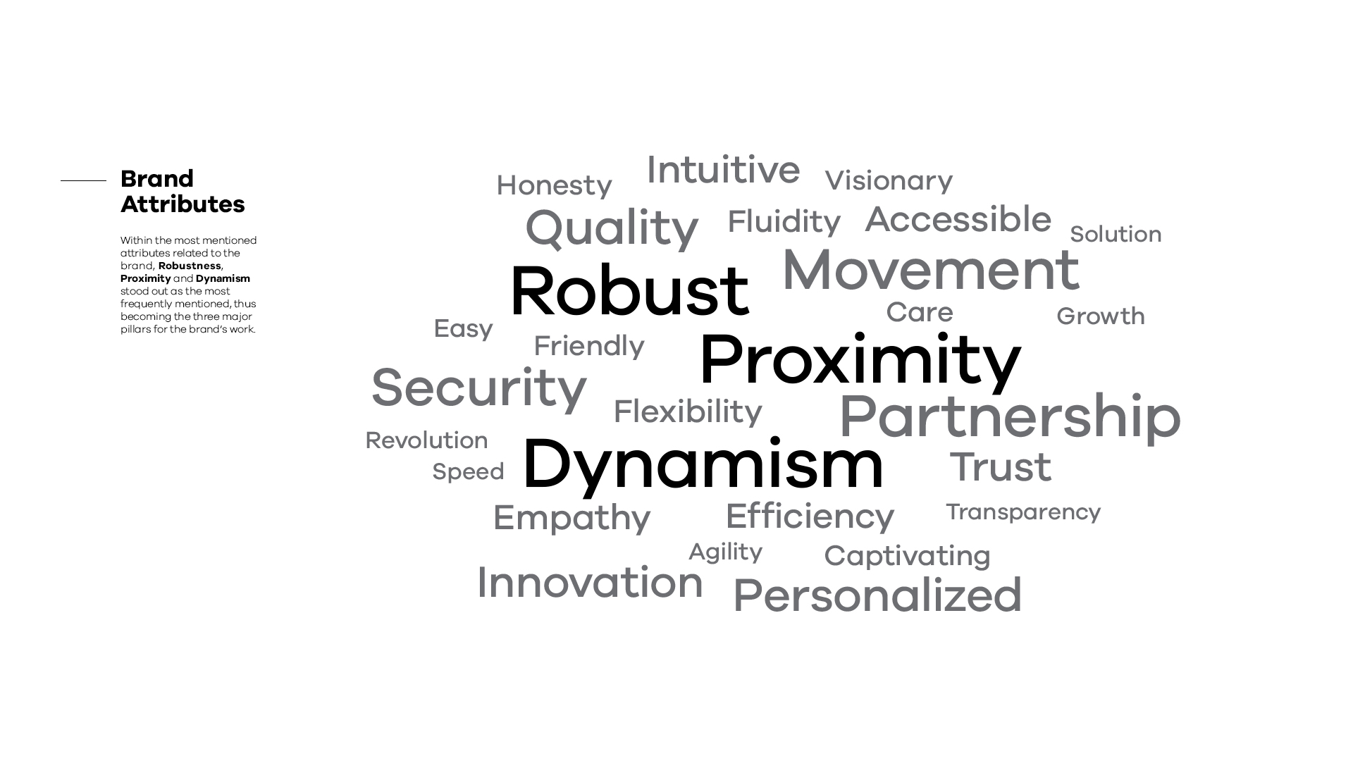
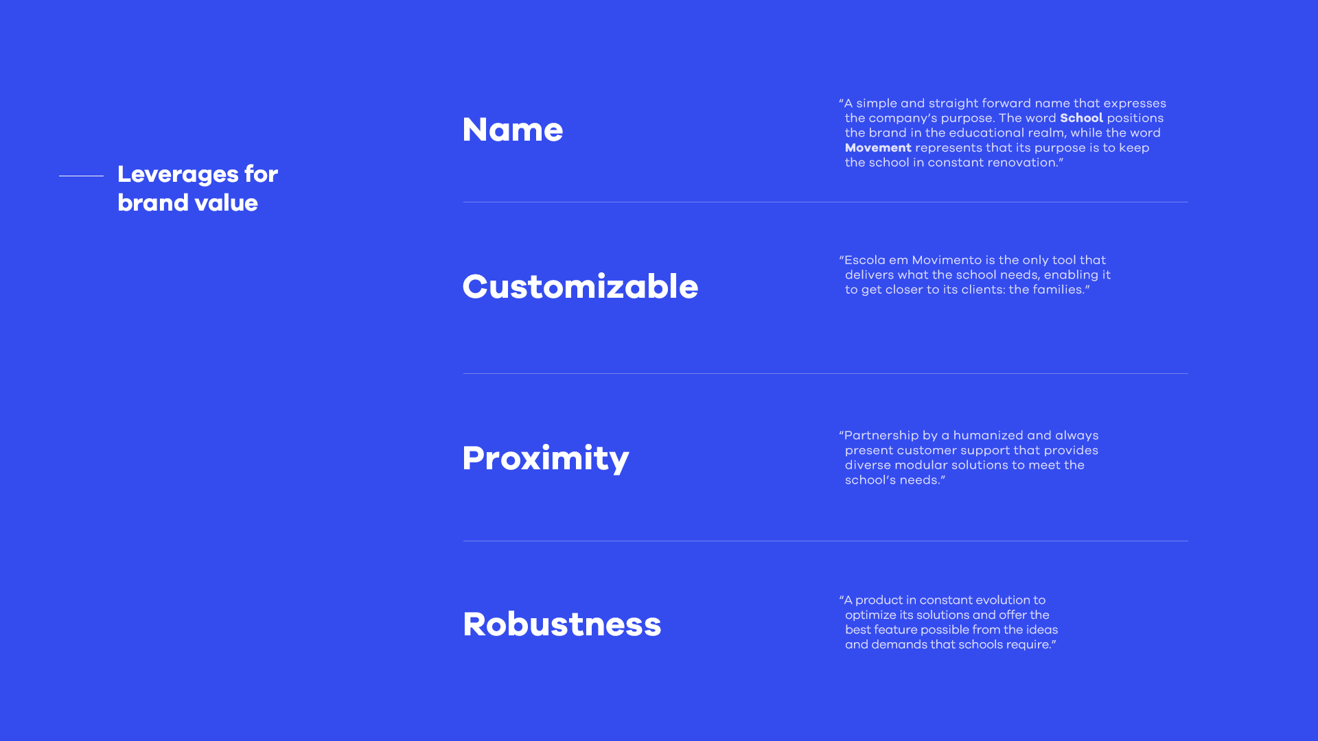
After identifying the brand’s pillars
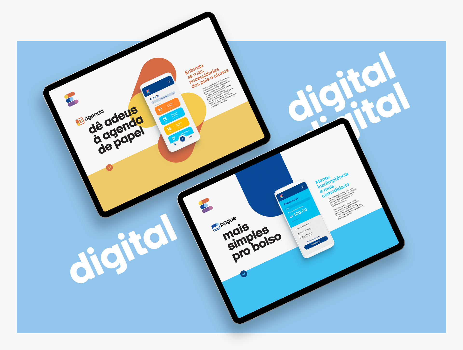
The next challenge was to create a symbol that expressed the ludic side of education and the dynamics of how schools perceive the company, understanding its innovative aspect and how customizable Escola em Movimento can be.


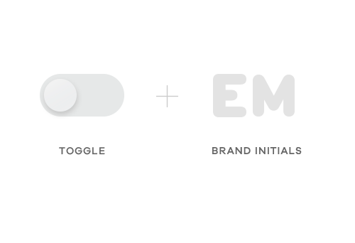
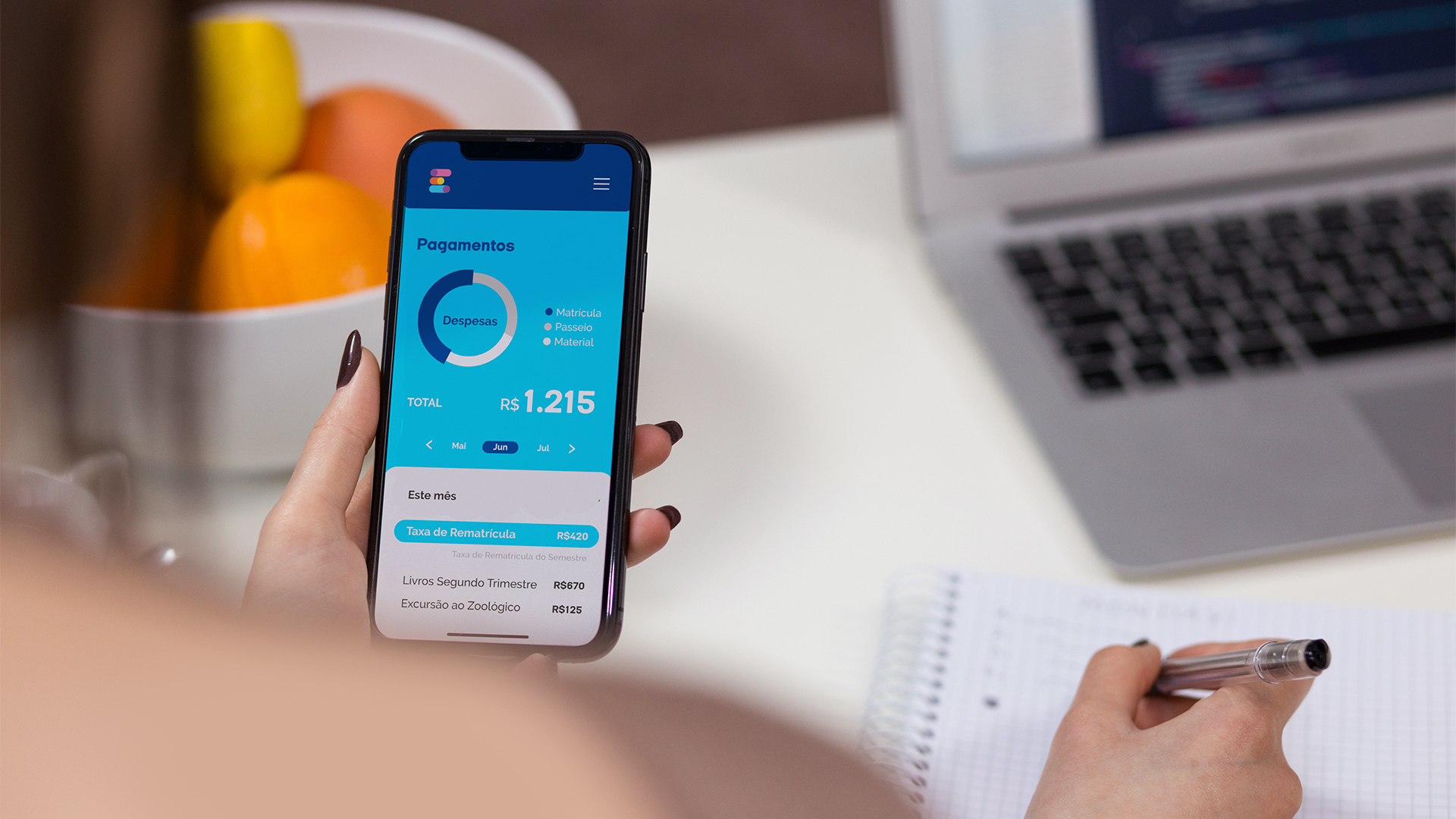
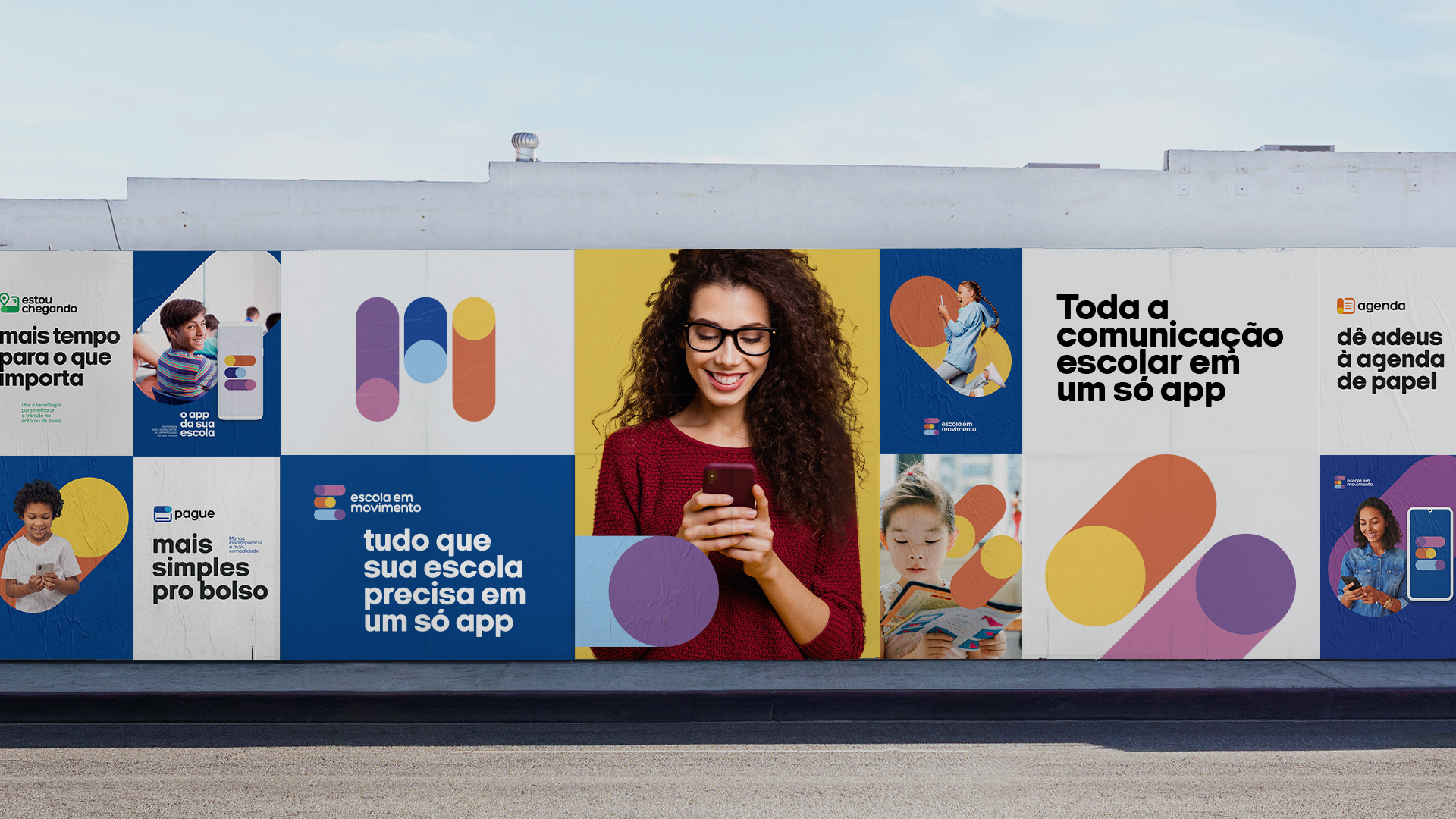
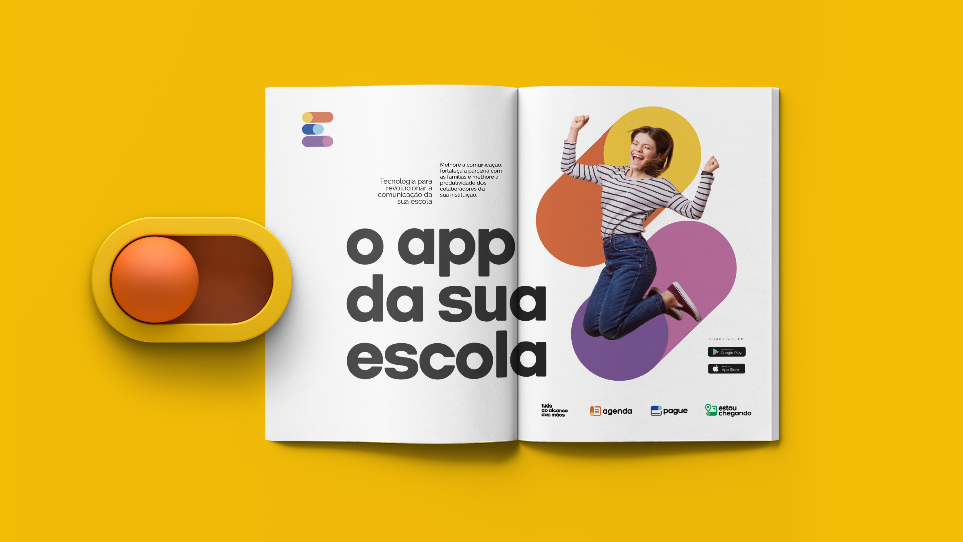
The symbols for the products combine two key features: the toggle switch and its round shapes as a starting point and representative icons.
03. BRAND ARCHITECTURE
Organizing the portfolio of products
We set up a strategy to guide the naming for the sub brands, not only for the ones already available in the market but also for future products. We chose straight forward names that clearly deliver the functionalities of each product: Agenda, Pague e Estou chegando (Diary, Pay and Arriving).

04. IDENTITY
Developing a visual language
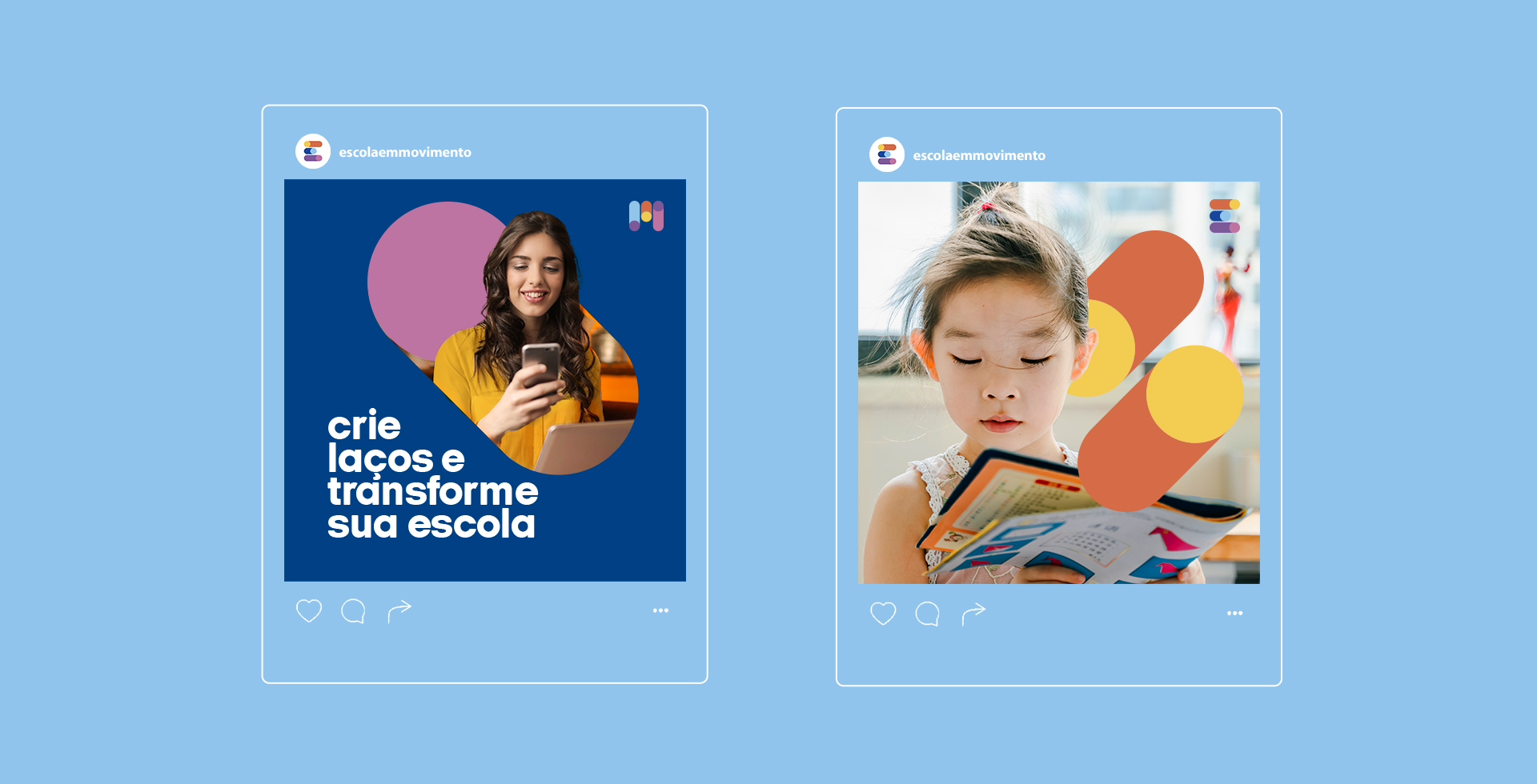
For the next stage, we developed a consistent visual universe for the new symbol that brought forth immediate recognition and further valued the brand’s strength in order to easily translate what Escola em Movimento is.
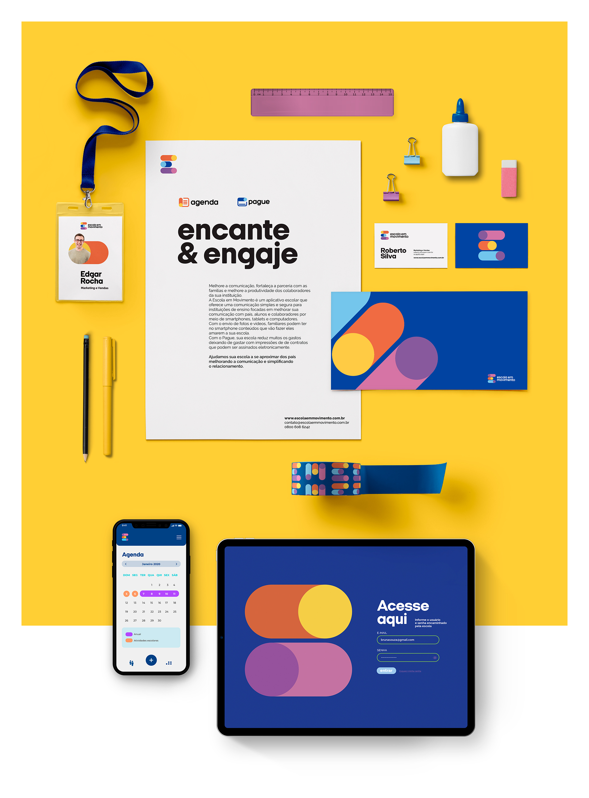


The finishing touch in this project was to offer instructions for the application and consistency of this visual language in a digital brand book.