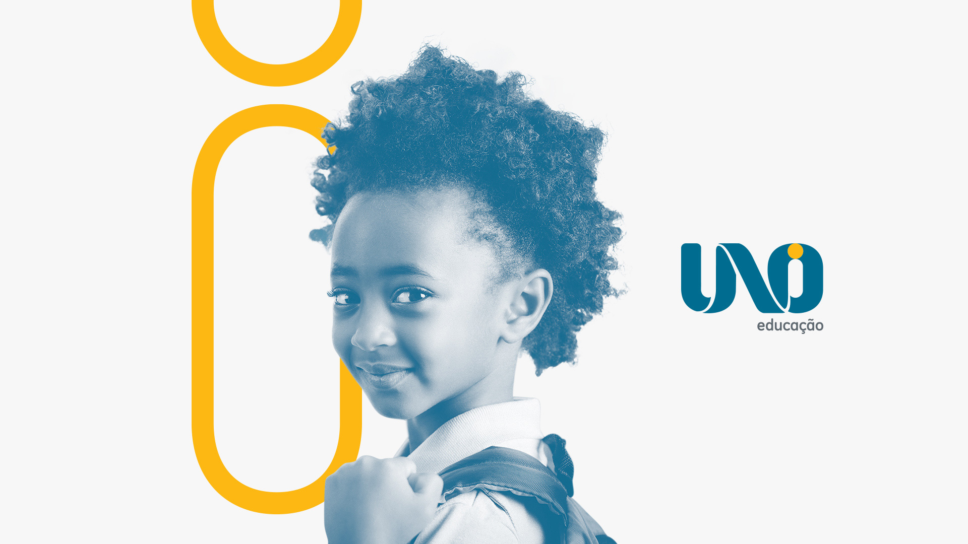
UNO Identity
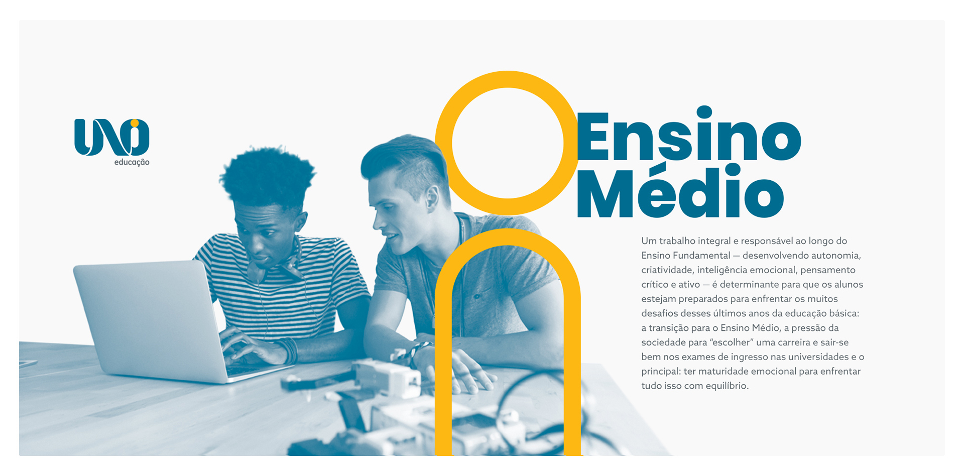
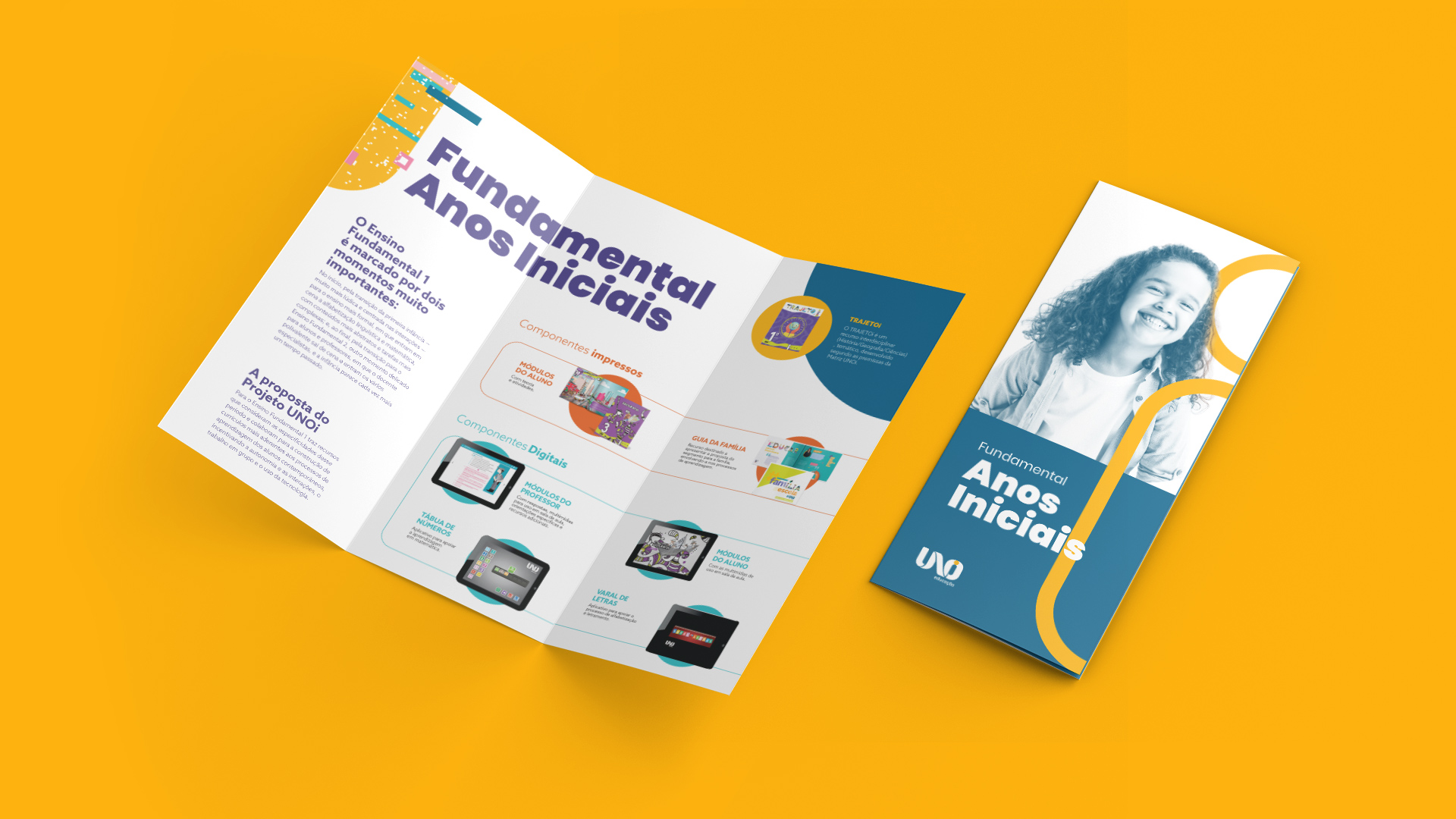
UNOi educação is a project for educational transformation created by the Santillana Group that promotes a structural change within the schools, converging the education principles of the 21st century with the most advanced knowledge there is in pedagogy, technology, content, bilingual education, evaluation and continuing education of the teaching staff. It was considered one of the 50 most innovative initiatives in education for Latin American by the IDB (Inter-American Development Bank). Currently, it forms a network reaching over 400 schools and more than 130 thousand students.
Challenge
Despite having a consolidated brand, UNOi educação lacked a defined visual language and its communication varied according to the year’s campaign. They needed to explore new possibilities on the way the project communicates, with its own approach aligned with the brand’s values and ideals.
Solution
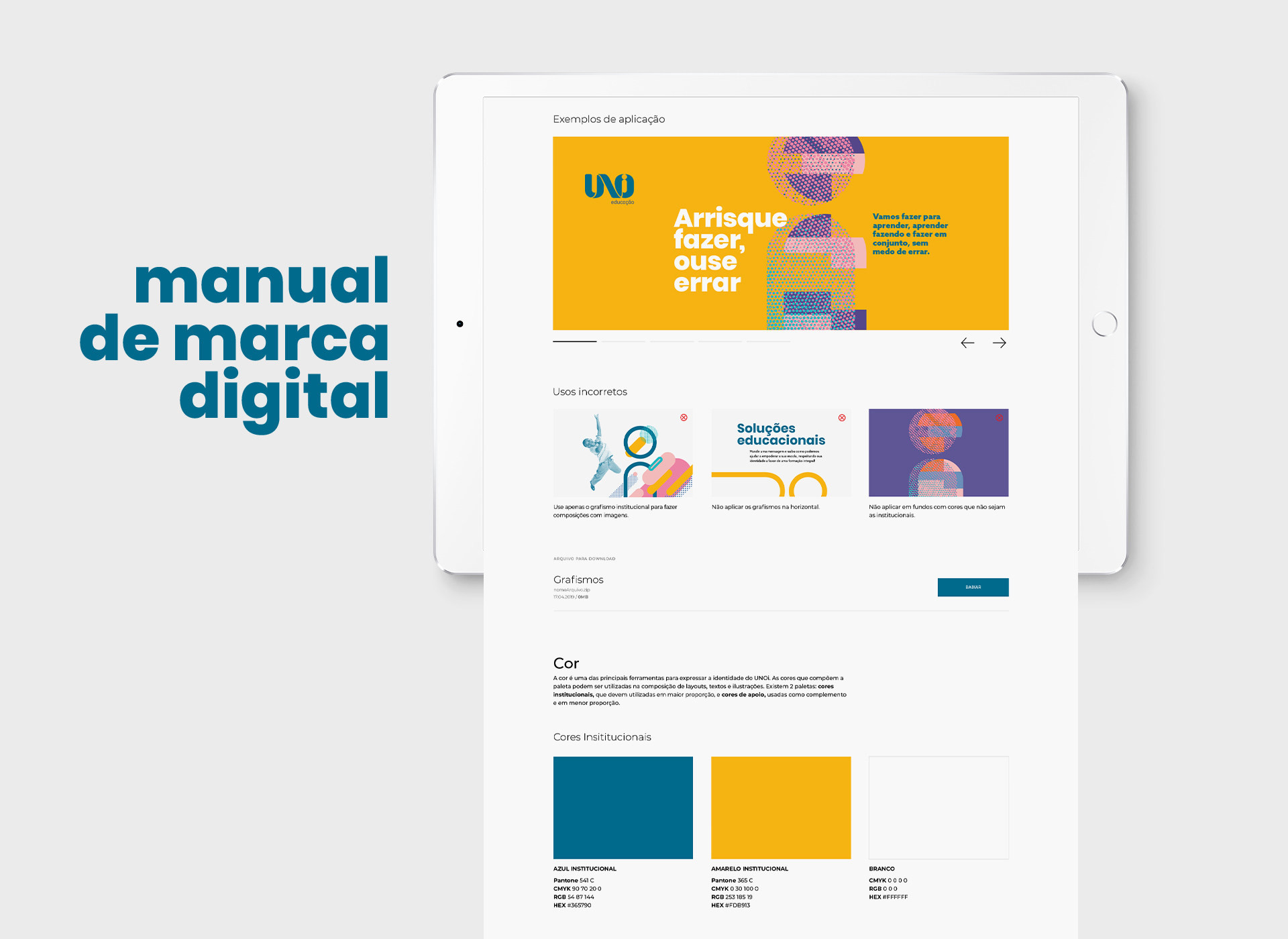
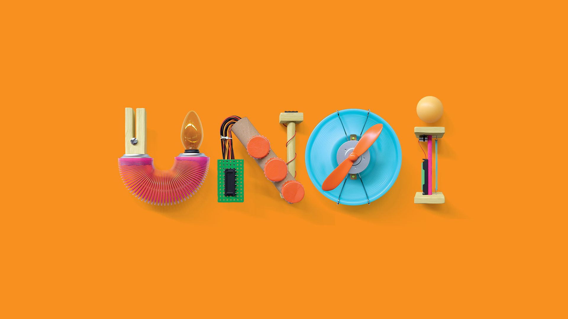
In the brand perception analysis developed with UNOi’s directive and managerial body we identified that the letter “i” became a valuable asset for the brand and it wasn’t well developed in its identity.
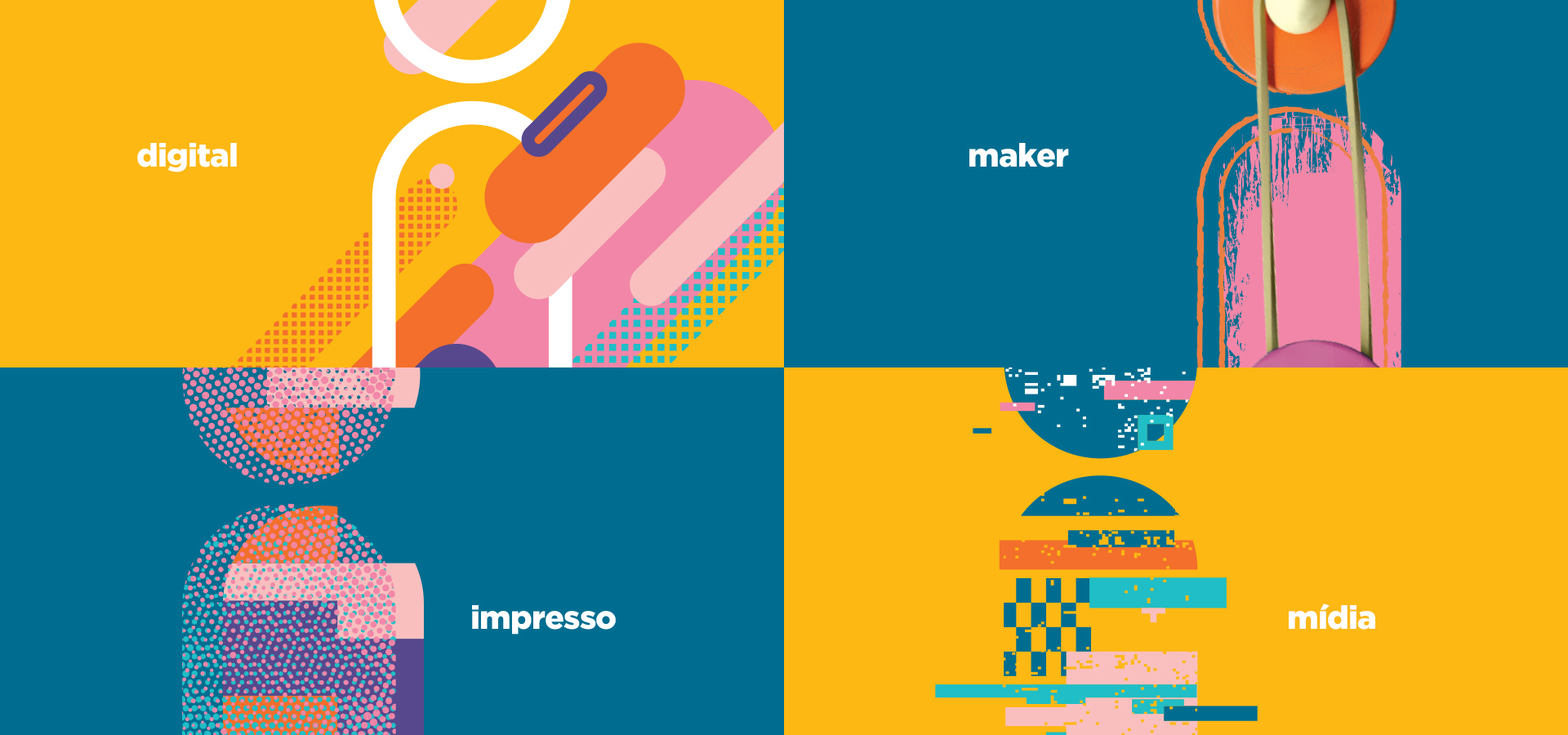
Besides portraying some of the company’s main features with “I”, such as innovation, intelligent, interactive, inspiring, integral and international, our concept was to value this letter by showing this project’s vast universe of resources and possibilities. We created graphic elements combined with illustrated versions of the symbol to represent this idea.
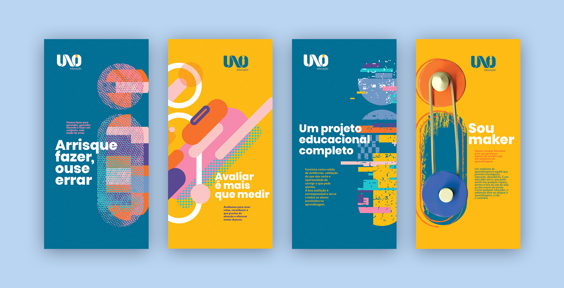
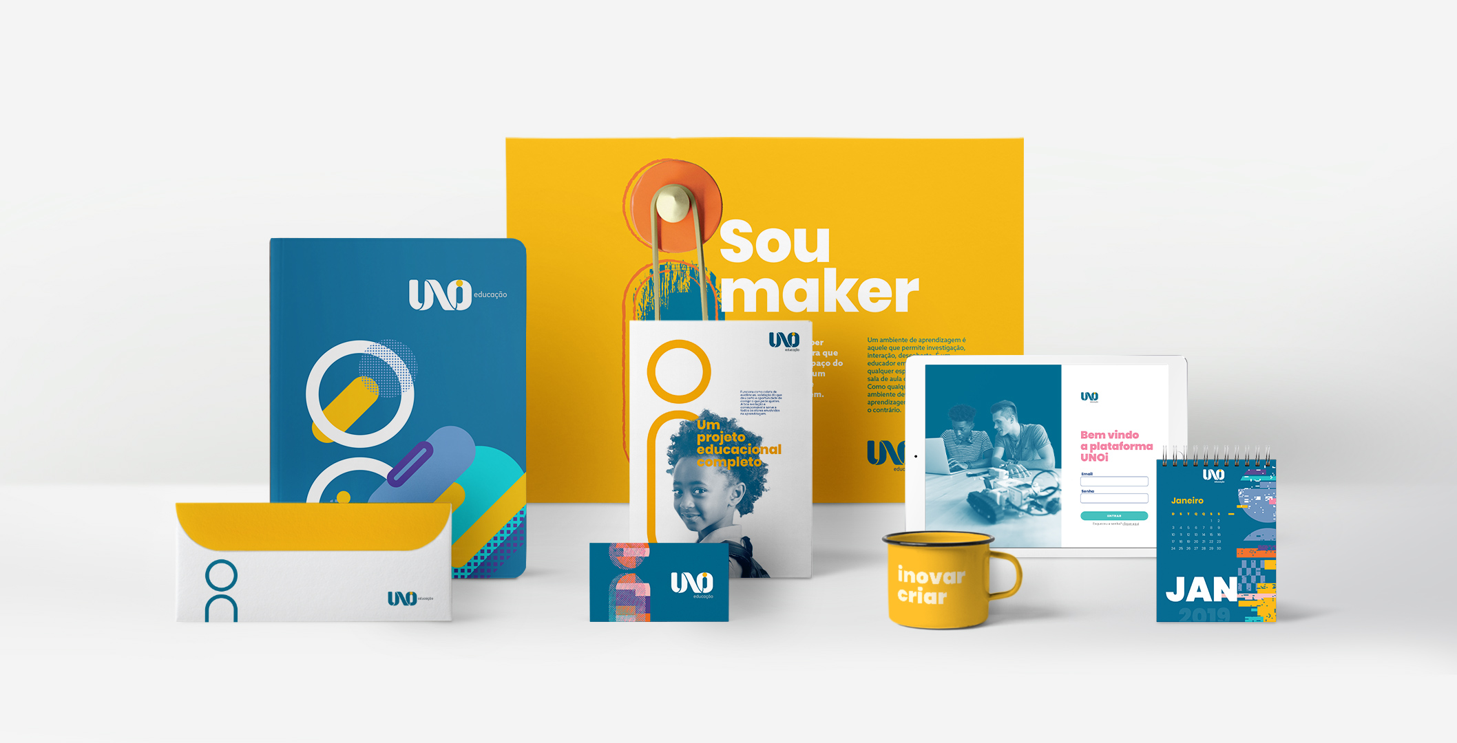
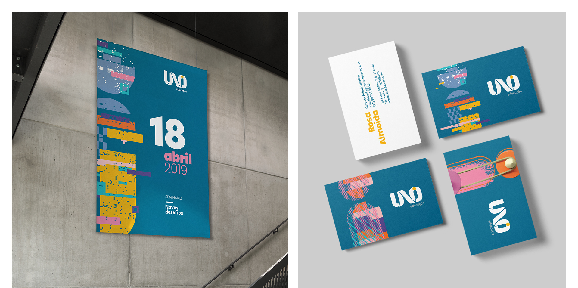
From the “i” in UNOi we developed specific graphics for the brand’s identity. There are five variations overall, and each reflects important features within the UNOi Project: institutional sobriety; the speed and practicality in digital educational tools; printed resources and their immersive power in the classroom; the different uses of new media for learning; and the maker culture that encourages trying things out and getting hands on in your projects.